
Tuesday, November 30, 2010


Here is a Fun Christmas Layout utilizing these FUN Freebies! Just add your photo to the center and Soften the edges by using the Soften Edge Filters available in the Format Ribbon. Flatten the photo and reapply the soften edge to thoroughly fade out the edges. Then use the Ellipse cutter found in the Cut and Fill Ribbon and shape into a circle! Have Fun!!

Monday, November 22, 2010


Saturday, November 13, 2010


Wednesday, November 3, 2010
Here is a Layout utilizing the Fall Freebies Posted Below. On this layout in particular I used some other designs I will post in the near future. 1. I added a photo and enlarged it. 2. I applied the Soften Edge and Glow Filters to it (Filters are found in the "Format Ribbon"). 3. I added the Fall freebies - For the Word art - Begin by selecting the word "Fall" with the "Wand Tool" found in the "Cut and Fill" ribbon. Select and choose to copy it. With the copied "fall word" change the color to a very light biege. Apply the Alpha Gradient Filters (soften and grass) found in the "Format Ribbon" under the Filter "Alpha Gradients" then use the "Soften Edge" filter as well in addition to the Alpha Gradients (Don't mistake the two - there is a soften edge alpha gradient - this is first in the list of Alpha Gradients - from there you can select soften, grass etc)... I know... a little confusing, but once you try it for yourself you will see what I am talkin' about :0) Now apply the "Soften Edge" Filter. Then apply the frosted glass filter (flatten and apply again for more effect) This filter spreads out the edges more evenly giving it a more finished appearance. These steps allow you to see the word Fall much easier when placed against a deeper background, rather than allowing it to fade in to it. It will appear far more noticeable to the eye, along with giving it a more polished, artistic look. 4th and last Apply some depth to the entire Fall Word art (the piece you began with) to this first layer apply the heaviest shadow in the top of the drop down shadow box. I then flatten and reapply this shadow 3 or 4 times in order to "burnish the edges". I look forward to seeing how you use these free embellishments! Be sure to upload your layouts to my Simple Pleasures Facebook Page!

Happy Fall to you! Enjoy these Fall embellishments perfect for those gorgeous Fall Photos! Remember I would LOVE to hear from you, input, suggestions, comments - Bring em' on! :0) Please share my facebook page and this blog with friends! TIP: When adding the word art to a layout don't forget - about the Color Ribbon - Here you can adjust the color of either your Embellishment OR your Background Paper to either make the embellishment POP OR show up depending on the depth of your background. I love using "Curves" to rectify this common problem. Adjust the curve to the bottom left to make your element appear darker or to the top right to lighten and brighten. Let me know if you have enjoyed or used these FREEBIES on your layouts and Please upload them to my Facebook Page "Simple Pleasure Designs by Jennifer Fehr". I would love to share your pages showing how you have used these fun FREEBIES! I will also periodically FEATURE one of these submissions HERE on my BLOG!!


Monday, November 1, 2010
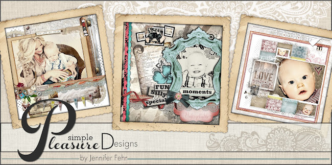
Did you know that the frame used in my blog header design was created in Storybook Creator 3.0. It all began with a photo of my son against a small barn style shed in My Parents backyard. I have used the planks in this photo to make all kinds of rugged embellishments. Some complete with the hinges right off the doors! If you never did save these freebies let me know and I will re-post them here on my blog! Would love to hear from you and what you may be looking for when you come for a visit!
Subscribe to:
Posts (Atom)


