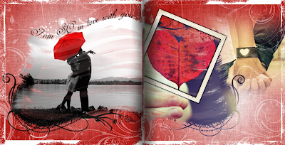
 Ingredients:
SBC+
Be Mine Digital Kit - CM (paper 4)
Photo Masks of my own design
(this was one of a set of exclusive masks I created for my Simply Digital Class attendees). Perhaps in the future I will make them available to members of my site - once I have my tutorials up :0)
Grunge Overlay and Frame - My own designs
- I began simply by adding a plain white rectangle stretched to the size of my layout and then filled it with a two tone gradient background of red and white.
- I used the gradient option at the very bottom of the selections second from the right. Make the "first color" red and the "second color" white.
- Once you have your background add the burlap surface found in the Format Ribbon.
- Now stretch your background so that the white center spills over the corner edge you desire. This is a simple yet effective look. (I used this exact effect on the "Just Be" layout of my son with orange and white-go and have a look to see another example). :0)
- I then added a white grungy edge (one that I created from an old photo). You can use any distressed overlay to achieve the same look.
- I added the Paper 4 from the Be Mine Digital Kit (then rubber stamped it in white).
- I then filled two of the same Photo Masks on either side with photos. (this was one of a set of exclusive masks I created for my Simply Digital Class attendees). Perhaps in the future I will make them available to members of my site - once I have my tutorials up :0)
- I used the text wrap feature in SBC+ to add the title.
- I then added the simple vintage frame and placed it on an angle for effect.
- The photo in the background was blended using the Soften Edge Filter in the Format Ribbon!


No comments:
Post a Comment