Thursday, April 7, 2011

Missing You... check out the free designs used to complete this page below!

Ingredients:
SBC+
Vintage Paper (find below as a free download)
Tatter Note Paper (find below as a free download)
Vintage Photo Overlay (find below as a free download)
Monterey BT Font
Office Supplies Kit (CM)
Digital expressions of Travel (CM)
Metal embellishment is an embellishment made from a photo of a book plate.

How to Create: 
  • Add Paper in the Background
  • Place photos on an angle (rotate with the small green rotation handle). 
  • Place Photo Overlay on top of both photos.  
  • TIP:  To shrink the overlay to match the size of your photo just select (depress your shift key) and using the white cropping handles drag and stretch to match the size of your photo).
  • Add the Tattered Note Paper and add text (I also flattened my text and applies the fractal map filter found in filters under the Format Ribbon) to give it a worn, washed out/faded appearance).
  • I then added the text Missing You - flattened it and filled with a paper (I used a paper I had created) but you could anything dark with a vintage feel).  Then add a white glow.
  • Lastly I added the metal embellishment and the string from the Office Supplies kit.  I zoomed up on the string and then using the cutters in the Cut and Fill Ribbon I cut it up into pieces - stretched the length to wrap around the photo and placed the bow on edge of embellishment as well as rotating it to be in my desired position!


Tuesday, April 5, 2011

My Little Angel...

This layout was a simple layout to create yet very effective visually.

Ingredients:
SBC+
Floral Vintage Paper Freebie
Jellyka Western Princess Font
A retired kit from CM called Rock Star (perhaps you have this one)

How to Create:
  • Add Paper to background
  • Add photo and enlarge.  Go to your Format Ribbon and Select Filters.  Locate the Threshold Filter.  Here you can play with the sliders change the high and low colors and find your desired effect.  
  • After applying the effect you are going to wand out the base color leaving you with a transparency of the photo as shown here!  This was a fun technique I taught at my last Simply Digital Design Class and will review again in a future tutorial!
  • The Wing and swirls are pieces I cut from embellishments in the Rock Star Kit!
  • Have Fun with this technique!

Vintage Floral Paper Just For YOU!!! Enjoy!

My Journal

Here is a layout I had a LOT of fun with!

Ingredients:
SBC+
Digital Expressions of Faith (CM)
Reminisce digital embellishments (CM)
Coffee stain from the Office Supplies Digital Embellishments (CM)
Ribbon (from Little Feet Digital Designs by Janet Carr)  
CHECK her out and see all of Janets Beautiful stuff!  
http://littlefeetdigitaldesigns.blogspot.com/
Papers are of my own design and an Old Book I played with in SBC (an image found online from a shared site L&T).
Many of the embellishments  are from pieces I have created - clips, tags, brads etc... soon to be found here as freebies if they are not already!

How To Create: 
  • I first added the Denim in the background and placed the Distressed paper on top - underneath the book.  
  • CREATE a book like this yourself ... here's how:  If you have an old book from days gone by just open it up and place it in your scanner - woila!  You can cover the text simply by cutting out pieces & copying them - place the pieces over the text until you have erased all of the words (To make this appear smooth and finished simply cut out a piece without words (use a square a circle cutter) enlarge the chunk you have copied and use the soften edge filter to blend the sharp edges.  copy and paste it all over the text until all you see is a blank page in your book!
  • To give the photos an old vintage feel I added some distressed overlays on top of them and changed the color to Sepia shrunk them a little and placed over discreet areas.  
  • I blended the photo up in the top right corner with the soften edge filter (tip - once you have softened the photo - flatten and apply the filter again to wash it out even further.
  • I also used the Color Ribbon and Warmed the photos up a bit to give them a more vintage feel.
  • I added the black tab mat to several photos (found in the Format Ribbon under "frames" choose "select" and be sure the "Frames" option is visible rather than the "cutout" option)!
  • This really was meant to look like a bunch of scattered pieces in a journal... so make it your own by adding clips, staples, distressed overlays scripty fonts etc!
  • Feel Free to ask any questions!

Some Fun Distressed Paper I made & some GREAT Denim just for you!


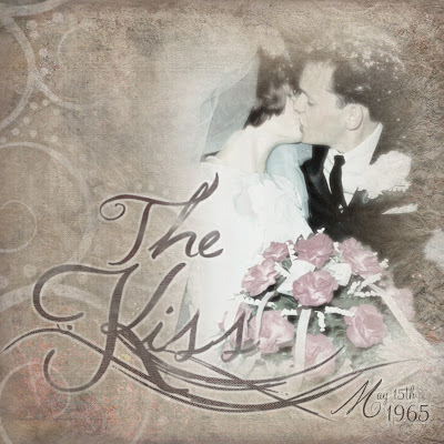
The Kiss...

Here is a layout using the Vintage Layered Paper Freebie
Ingredients:
SBC+
Vintage Paper Freebie
Jellyka Western Princess, Monterey BT & Jellyka Waterways Seafare Font Styles.

How to Create:
  • Simply Add the Paper in the background and then place the photo on top.
  • Enlarge the photo until it nearly fills half the page. 
  • Now, go to the Cut and Fill ribbon and select the "Straight Cutter" drop the menu down and locate the blended edge. 
  • Now blend each edge of the photo quite substantially.  Use the green rotate circles on the cutter to shift it for cutting the top and bottom.  For side to side cutting just look in the tool box and select invert the shaded area - this will allow you to blend one side and then invert and blend the other side.
  • Now add your text (I flattened my text - filled it with a color sampled from the page itself) I also applied the small burlap surface (found in the Format Ribbon).
  • To create the swirly effect on the the Letter "K" I created a text box and entered the letter K with the Jellka Waterways Font (flattened it) enlarged it and then cut the swirl away from the letter.  I then placed it just slightly beneath the word Kiss.
  • The Word Kiss was created with two font styles the "K" is Monterey BT and "iss" is Jellyka Western Princess. 
  • "The" is Jellka Western Princess.  Some of my new favorite "Scripty" Font Styles!
  • I also used the "fractal map filter" found in the Format Ribbon under filters.  There are several choices in the drop down menu when you select fractal map - there are high clouds, mist, heavy clouds, noise etc... I wanted the text to appear as though it was wistful, blended into the background somewhat - so the fractal map filter applies this effect.  I believe I went in and applied a few different "fractal map" features to the words.  
  • TIP:   Once you have created your text - flatten the words and then select each word while depressing your shift key - right click and group them all together - now you can apply effects to the whole rather than individual words.
  • I also applied shadows and a custom glow in white.

A Fun Layered Vintage Paper Freebie I created just for you! Check out the layout of my Mom and Dad's Wedding Kiss :0) to see it in use!